Logo
Right now I’m in my Graphic Designer head, which has gotten me to thinking about the design of the Logo for our new game; then also with that, what the Steam store assets will be like.
Whenever I try to design a logo for one of our games I think about a seminar I went to a year or so ago, that was based on how best to market games on Steam. Including the best practices for visibility and engagement etc. It can be hard for certain games to get across what type of game they are, and to also draw enough interest from those who would likely enjoy that particular game.
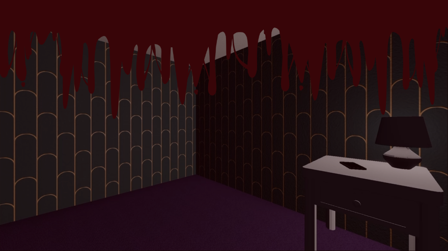
The main issue for me at the moment is spoilers. I want to try and keep a lot of the game hidden so that players will hopefully be surprised with what they encounter when they play it, but most importantly, it also needs to be clear from the start that it is a horror game. I really don’t want people who do not play horror games accidentally getting it!
The biggest piece of advice I got from the seminar was how to pull in an audience for horror, especially if the game and or representation of the game is muted, either in colour, style or imagery. Basically it’s to use red. Red is a great colour for Horror as it represents blood and danger, and it can really stand amongst other colours too. Without that I think The Trials - Chapter One imagery wouldn’t pop as much as it does now. Before the seminar I only had the original colour scheme from the game to represent it, which is only black and green. After the seminar I added in a healthy serving of blood splatters and such, it really helped it stand out way more and it also makes it clear right from the start what the genre of the game is!
I have some ideas for prototype designs for the logo, but the store assets and representative in game screenshots will be something else! I’ll start off small and see where the designs take me. In my head it looks pretty cool, hopefully I can translate that in the design!
ハンナ